
Visualizing Cities
The rising tide of urban data is transforming the field of urban planning. Studies utilizing cell phone data, social network service data, sensors, and satellite imageries have opened up new avenues of inquiry to quantify the built environment and model formerly hidden human mobility dimensions. Despite the myriad ways to synthesize this newly available information through the lens of city planning, the act of shaping cities remains a political gesture often legitimized through the use of data.
Volume 16 of Projections, the Department of Urban Studies and Planning's journal published by MIT Press, centers on the relationship between the epistemology of data, data-driven measurements, and the politics of designing urban places. Along with a call for papers, the editorial team for Projections 16 also sought the submission of data visualizations that analyze city dynamics to inform urban planning practice and advocate for just, safe, and equitable cities. Submissions from over 31 countries highlight visually compelling stories while also exposing pressing urban issues. All the visualizations are hosted on Visualizing Cities, a digital exhibition that accompanies Projections 16.
“Visualizing Cities asked contributors to reflect on the role of map-making as a practice to visualize 21st-century urban challenges,” said member of the editorial team, Carmelo Ignaccolo. “Submissions primarily engaged with the spatialization of global inequality in a time of climate emergency and the future of public transit in rapidly sprawling cities. The entire editorial team was impressed by the diverse array of spatial representations, acting as tools to interpret our present and envision a more equitable future.”
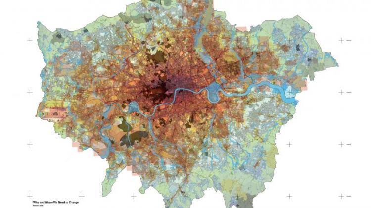
The Projections 16 editorial team include doctoral candidates Carmelo Ignaccolo and Arianna Salazar Miranda as well as DUSP alumna Chaewon Ahn (SM ’15, PhD ’21). “The selection process was very intense given the large number of competitive projects that were submitted,” said Ahn. “We narrowed down the selection with projects that not only had a clear and innovative visual communication but also were based on rigorous research. We were humbled by the large number of impressive and thoughtful work that we had the opportunity to review.” The team awarded The Atlas of the Carbon Economy by Jamie Williams (University of Westminster) with a Best Visualization award and celebrated Why and Where We Need to Change, London 2020 by Ben Pollock (4D Island & Jestico Whiles) and Satellite Remote Sensing of Nitrogen Dioxide (NO2): Transport Pollution in Russia by Nabi Agzamov (STRELKA KB) with two honorable mentions.
“The Visualizing Cities exhibition exemplifies how maps and illustrations can leverage data to expose city planning and design issues,” said Salazar Miranda. “We were particularly fascinated by the range of creative data visualization techniques used by participants to explore topics around public space, urban form, and the vulnerability of natural ecosystems. We are so glad to be able to share all of the visualizations with the public through the digital exhibition.”
Want to learn more about how urban data is transforming the design and planning of urban spaces? Check out projects and papers by the editorial team (links to the right).